The DIY ad kit for Islamic banking
Published in May-Jun 2012
Let’s face it; the world of advertising is a make-believe world. It is a world built on outward appearances and people ridicule it for its superficiality. However, a lot of effort goes into making that artificiality appear real and in most cases the success is determined by how close to reality the advertising appears to be.
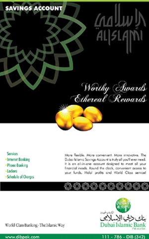
Sadly, superficiality is rampant in the advertising we see around us and nowhere is this most painfully obvious than in the advertising for Islamic financial services. There seems to be a customised DIY kit for churning out communication for Islamic banking.
Geometric motifs

Some form of geometric element is essential. Pirated CDs used to be the rage a few years ago, when for a meagre Rs 50 one could buy a CD chock-full of ready-to-use motifs, icons, templates, etc. Nowadays, it is easier (and most importantly, ‘free’) to log on to the internet and find the widest variety of visual elements a mere Google search away. (Make sure you type ‘Islamic’ along with ‘motifs’ to ensure you don’t end up using Romanesque motifs.) However, with the explosion of lawn this spring, I am sure one can easily use the textile design/filigree motifs and pass them off as pseudo-Islamic for use as backgrounds in the design.
Arabic looking text

Swirly-whirly, calligraphic logos, with lots of ahrab or accents, the more the better. Whatever the language of the logo, it ‘must’ look Arabic… because ‘obviously’ Arabic equals Islamic.
The colour green

This could be an ‘Islamic’ sequel to The Colour Purple for which Oprah ‘didn’t’ win an Academy Award… but in this case it’s the essential palette for all Islamic banking communication. The only exception being if the brand has an obviously ‘Islamic’ pedigree, in which case other colours may be explored.
Arches, minarets and domes

This one plagues the architectural arena as well; the easiest way to create an Islamic look is to plonk a dome on a building or plaster pointy arches all around. Fortunately, in art direction terms one could be more subtle about it; unfortunately, we still end up making a pastiche. It seems just as ridiculous as pretending that our clothing suddenly becomes ‘Islamic’ with…
The hijab

As women are the more popular choice of gender in advertising imagery, they need to wear a hijab otherwise advertising for Islamic banking will just not fly. I would lump other ‘Islamic’ accessories in this category too; tasbeeh, topi, etc.
Profound copy

Any thesaurus will do. Take key words with even a remotely sublime/profound/ pseudo-religious connotation and apply basic copywriting rules to it. And voila, you have an ad that is bound to be a hit with your target audience. Don’t forget to add a healthy overdose of solemnity and ‘preachiness’ to the voiceover if it is being adapted to radio or TV.
The advertising of Islamic banking services suffers from a similar malady that afflicts most ‘Islamic’ art as it is practiced today. It lacks soul and is mostly superficial mainly because it is not true to its essence. (It is beyond my jurisdiction, whether or not ‘Islamic’ banking as practiced here is truly Islamic, but perhaps that is the core of the problem.)
Anyway, the advertising we see vacillates between product-focused communication, with a cosmetic application of Islamic motifs, or lightweight, seemingly profound ‘thematic’ ideas, where the financial product seems out of place. Juggling the balance between thematic and product-focused communication is something we all struggle with every day of our advertising lives, but if one manages to tap into a core insight/idea/belief related to the brand, and if one has a talented art director to work with, there is no reason why a memorable piece of communication cannot be created.
The only example that comes to mind was the main bhi Ameen hoon campaign by UBL, where the DIY kit outlined above produced something which was intelligently simple, visually crisp, and profound without being preachy and at least something worthy of ‘Islamic’ banking.
Adnan Syed is Chief Creative Officer, Adcom.
adnans@adcompk.com


![The [Muslim] consumer and [Islamic] marketing The [Muslim] consumer and [Islamic] marketing](https://i.dawn.com/thumbnail/2017/04/58e60a3ec069b.jpg)
Comments (6) Closed