Flashback time: I had recently started working at Pakistan’s ‘only MNC ad agency’ (it’s rather inevitable for those in the business of brands and selling to claim all manner of exaggerated singular achievements for themselves) when they landed a huge account. One of the first items on the agenda was the launch of a high-calcium, low-fat milk brand.
Cue hours (weeks) of brainstorming, fortified by ever-stronger cups of coffee and progressively louder arguments. Eventually, the brand was launched with innovative packaging and a sleek campaign featuring skinny, beautiful people grunting in a gym before parading about dressed in high fashion – in other words, a depiction that barely 0.00001% of the target audience could even decipher, let alone relate to. After a brief struggle, the brand tanked and was pulled from the market. Conclusions ranged from ‘people are not interested in low-fat milk in this market’ (perhaps pre-launch research would have helped determine this assertion) to ‘product issues’ (dubious, given the amount of testing done) to ‘price!’ (the evergreen scapegoat) to ‘too aspirational’ (and we have a winner!).
In Pakistani advertising, ‘aspirational’ usually equals outrageously luxurious lifestyles, enacted by impossibly beautiful people. The brand that must not be named did exactly this and failed spectacularly. Do fitness freaks even drink milk? How many women in Pakistan go to the gym when men are around? Nesvita showed us how to do it right years later, with a platform relevant to women and an approach that verged on inspirational (not the same!), while still having both feet firmly on the ground.
I have bored you with this ancient history for a reason: Nurpur low-fat milk. The campaign received a fair amount of attention, but how does it compare to Nesvita and the extinct brand mentioned earlier?
I would say it falls somewhere between the two. The tagline is memorable and relevant, a welcome occurrence in a country where too often, nonsensical taglines and copy are used because apparently they sound ‘catchy’ – yes, I’m looking at you, Pakistani confectionery brands and lends itself well to social media. The packaging fits with the range, although I still find black an odd choice (it stands out, sure, but it just doesn’t go with dairy and if that means I’m old-fashioned, so be it!).
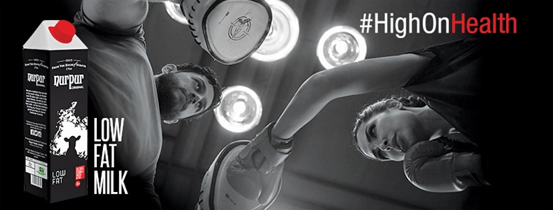
The TVC is likely the most unique aspect of the campaign and it scores well in some areas. It’s nicely made and I like the black and white (B&W) treatment as that is generally deployed to evoke nostalgia, which is obviously not the case here. It’s sleek and modern and it doesn’t feel fake – there is a certain grittiness to it, reinforced by the setting and especially the female model, who seems extremely comfortable with the strenuous workout she is doing, while also managing to look well put together. Frankly, anything that shows women in a role outside the standard wife-mum-equal- martyr portrayal has my vote, even if hardcore gym workouts are not a prominent feature in the lives of the majority of the target audience. In this case, I think there is a genuine element of aspiration, beyond the generic perfect life stuff we see so much of – everyone wants to be fit these days, after all. I also like the lack of voice-over throughout, as it helps keep the focus on the action.

And yet... it doesn’t make the sort of impact I thought it would have. It feels like a montage of different exercises rather than an advert. It doesn’t have a proper peak, somehow staying at the same level from start to finish. The juxtaposition between the man and woman is unclear – they start off almost like rivals, then look as though they are working together, and by the time the woman chugs the milk (while sneering at the man), it seems like they are rivals again.
And that brings me to my biggest peeve: chugging milk. In the gym. During a vigorous workout. That just ruins the entire ad for me because it’s jarring and fake: anyone who has ever worked out knows how detrimental it would be to drink anything as heavy as milk (even low-fat milk) while your heart is racing and you are sweating a bucket a minute. And it’s unnecessary in an ad that is remarkably restrained in some aspects. Wouldn’t it be enough to show the brand at the end, and trust your audiences to make the connection between low-fat milk and fitness? Why must there ALWAYS be a consumption shot?
End score. Stands out, largely relevant, refreshing representation of a woman, but could have been better.
Now for something wholly different! Bank campaigns are uniformly stodgy, and with good reason; when it’s about money, seriousness is key! Some banks have attempted to ‘capture’ younger audiences with rather dismal results. Apparently it isn’t enough to launch a credit card that is exactly the same as any other card, but in a brighter colour and expect it to succeed with young people. Shocking!

Which brings us neatly to ‘HBL ID’. Not brilliantly innovative by any means, but relevant, which is far more important than being creative in my view. The offer fits the audience and the attempt to portray five distinct personalities (IDs) isn’t bad, although clichés abound within (dreamer/genius/ insert-other-generic). Using social media is the right strategy, though a lot more can be done via active audience engagement and user-generated content. In fact, the activation done in August, while simple, was effective in the way that it synced with the target audience: selfies are, of course, user-generated content and also obviously, the new everything. In a category that churns out dull, uniform campaigns with monotonous regularity, ‘HBL ID’ is at least different and employs an approach that is meaningful to its demographic. We live in a world of pithy labels, positive and negative, so one must commend the brand for spotting and using this insight. Coupled with HBL’s League Internship Programme, it appears the bank is focusing on younger audiences quite a bit, which is a sound strategy in a country with such a sizeable youth population.
End score. Sound strategy, relevant execution, not brilliant, but workmanlike.

To wrap up, I will touch upon Whistlez Biscuits: big budgets, expensive-looking TVCs, hip young people. Unfortunately, the brand name and positioning don’t work for me. The name? Self-explanatory. The positioning? I’m not a fan of shaky links between insights and product/category. Having a biscuit, no matter how utterly delicious, does not give you courage (we have heard of liquid courage but this isn’t the same, unless there are secret ingredients we don’t know about!). It probably gives you a hint of happiness, maybe a sliver of contentment if you are in a great mood and/or easily pleased. But it won’t magically help you conquer your fears. This is the sort of thing we see a lot in Indian commercials; someone happens upon a likely genuine insight and desperately tries to make it fit the brand in question through the most tenuous of links. The result is haphazard and one is usually left with a vague memory of the story, but absolutely no recollection of the brand – a massive fail in my opinion.
End score. Flash sans substance, unconnected and most unforgivably, slice-of-life!
Sara Qureshi is a marketing professional.


Comments (0) Closed