
I was surprised to read that Burberry have not changed their brand identity for 20 years – because in almost every other respect Burberry have been trailblazers in marrying tech’ modernity and classic style, especially under the guidance of Angela Arendts (who left to go to another style icon – Apple)
Brands that are seemingly unchanged for many years are almost always revealed, on closer inspection to have been changing all the time. Every year (or other year) brings a tweak to the visual identity. Try googling other classic brands, such as Coke or Apple, and you will find that the logo has changed considerably when early versions and most recent incarnations are viewed side by side. These changes are not made in big leaps – but regular small evolutions of identity to keep it fresh (see images below; you too can play this game – just do a Google image search for ‘changes to (insert brand) logo’.


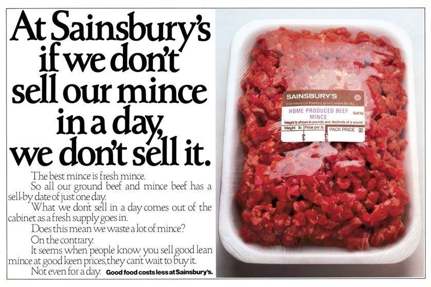
• Consumer culture: an endless search for freshness Not changing the logo is, ironically, a decision to change the meaning of a brand. Why? Because the world around the brand is in constant flux; consumer culture is a quest for a quality of freshness, of a contemporary mood and feel. Art directors, graphic designers and typographers spend their waking hours looking at layouts and TV end frames and wondering “is this a bit dated, can I make it feel a bit more modern?” It is a relentless and never-ending process. So, if your brand decides not to change at all – one day you will look at the visual identity and think: “gosh, that’s a bit stale”. You will not be able to put your finger on the exact moment – it will creep up on you. Because you have not changed and consumer culture has. To see what I mean look at early awards books for great press ads. Here is an example from the great days of David Abbott, when AMV created a distinctive typographical style for Sainsbury. It is great stuff but the style is dated. To avoid this fate, well-managed brands therefore evolve all the time.
• So, is the Burberry logo a success? It is a bit bland, a bit “Globo”; the kind of deracinated brand you encounter at international airports. It is an aim for acceptability; something you can see and read quickly as you wait for your plane in Terminal 4. Something not too individualistic or distinctive.
• Is the demise of the Leaping Knight a big deal? Brands are normally well-advised to hang onto their ‘instantly recognisable visual assets’ (MacDonald’s Golden Arches or the Apple logo with the bite out of it), as they represent instant mental shortcuts to the brand. But Burberry have not invested much meaning in their leaping knight – so, bless ‘im, he has been cut adrift. In one respect, though, I think the logo is a failure. In a bid to hang onto a little bit of ‘authenticity’ (that much overused word in marketing) and ‘heritage’ (a word that is often a mask for an invented past), Burberry have chosen to describe its provenance as ‘London England’. To English ears, this sounds like the V/O on a lowbrow American film. If people do not know that London is in England, then they are probably not the target audience for an expensive luxury brand like Burberry. The pity is this: Burberry really does have a history that goes back to the trenches and the World War I – yet this logo makes it look like a brand with an invented past.
On second thoughts, I think I would have hung onto the leaping knight. At least he was a bit quirky and different.
Julian Saunders was Strategy Director, Ogilvy and Head of Strategy, McCann Erickson. He has worked on behaviour change campaigns for the UK Government and on innovation in The Zoo at Google. He blogs at www.joinedupthink.com


Comments (1) Closed