Why Lemons Rule
Published in Jan-Feb 2021
Let’s begin with the obvious: this must have been a nightmare brief: “Yeah, so we would like you to sell to America a really ugly car that the Nazis have made. What’s that? The World War ended less than 15 years ago? Yeah, we know. Also, sorry, but Americans like big, beautiful cars and this one is tiny and looks like something that should be pushing a ball of dung. Good luck.”
But as fortune may have it, or as VW’s fortune may have it, the brief was taken up by a group of brilliant people who would not only transform the brand into the biggest success story in automobiles, but would alter advertising forever. Metamorphosis, after all, starts with a bug.
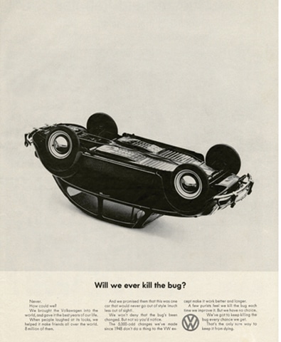
What was it though about these ads? My take on this, going back to the challenge of the brief, is that Bill Bernbach’s team felt that the only way to make this work was to get more ridiculous than the brief itself. Be all in and do things that have never been done.
But let’s start by looking at what car advertising looked like in the late 1950s.

Look at all those pretty colours, the aspirational images, the braggable size of the cars, the big brand name splashed big and bold so that even those who didn’t have enough eyesight to drive wouldn’t miss reading them. I can imagine Bernbach and Krone had a wall full of these ads too, and simply asked themselves: what are all the rules we can break?
Rule 1 of Car Advertising: Show the Product Big and Bold Up Front. SHOW IT BIG

Volumes have been written now about this genius work of zigging when everybody else zagged. But my word, the courage that would’ve been needed to actually not even write the name of your brand when you’re launching it. And let’s show the product so small that you’d think it were a mistake, unless you read the headline, which, wait, is a negative. Oh, and the logo? Let’s put it somewhere where nobody had before: BETWEEN the second and third column, awkwardly.
Rule 2: Always have a High Aspirational Tone to Your Message

Honesty goes a long way. As does a sense of self-depreciation. Let’s face it: the car is funny looking. So let’s cash in on it. Especially when everybody else is so serious.
Rule 3: Show the Consumer Enjoying your Product

“So what we would like to show is a driver pushing our car. That’s right, pushing. No, not driving,” is a sentence that I would love to be a fly on the wall of the boardroom to witness during the presentation. But here it is. A seemingly negative message with an incredibly memorable positive.
Rule 4: Show the Best Angle of Your Product

A simple, effective rule in engaging somebody to read your message is to show them or say to them something that they have never seen or read before. I don’t care how big a champion you are of doing the regular, there is no way you would not stop to look at this if you were going through a magazine.
Rule 5: Never Show the Product in a Negative Manner

A big X over your product. A big X. This isn’t an ad, it’s a heart attack on a page for anyone who likes the conventional.
Rule 6: Obey All Rules or You Won’t Sell

I wanted to end with this one, because to me, this one single page breaks almost every rule there is: No product at all. Not even the name. Calling the product ugly. A message that is cryptic at best. No human enjoying the product. No aspiration.
Most would say emotionless and cold, but truth be told, it has the strongest emotion of them all: humour. Driven by wit.
It Was All Effective. So Why Aren’t We Doing It?
The campaign has been named the greatest of all time by several marketing experts. It built Volkswagen into a massive company that has now sold millions and millions of cars (yours truly has now owned two VWs, while my father owned one). VW would not have stood a chance had they not gone down this route of being completely different than anything out there, much like the product itself. It wasn’t just the agency, of course; the brand team is as responsible for running with this brilliant work.
It’s saying something that the same ads stand the test of time today, 60 years later, and in fact are probably much bolder than most work we see. One VW ad that I didn’t show, which was also probably one of their boldest, called the car a “Lemon.” (If you haven’t seen this one already, you really shouldn’t be in advertising). A lemon is a car with defects. In the sixties, and even today, it was probably the last thing you would call the car you were selling. Especially in your own ad. But here’s a group of mad ad people who said, “Well everybody says their car is the greatest, so what can we say about ours that’s different?”
Maybe that’s all it takes.
Ali Rez is Regional ECD, BBDO Worldwide. He is an 11-time Cannes Lion winner. a.rez@impactbbdo.ae


Comments (1) Closed