Anatomy of an AdAsia Logo
Published in Nov-Dec 2019

From the diversity of Asia’s cultures to the uniformity of its values, AdAsia 2019’s theme ‘Celebrasian’ is about everything Asian that is creative, open, modern and which makes Asia the hub of creativity and innovation. As we celebrate the growth of advertising and marketing in Asia, we also embrace the technological innovations that are shaping the future of advertising.
Taking inspiration from calligraphic arts, a classic tradition of the Indian Subcontinent, Persia and Turkey, where animals and birds are drawn using alphabets and combining it with Pakistani folk culture’s truck art colour palette, the logo identity of AdAsia2019 is the first one in the 61-year history of this prestigious Congress to have been rendered in the national language of the host country.
The peacock was chosen as the symbol to represent the diversity as well as the harmony of the Asian continent. The 15 distinct tail feathers in variegated plumage represent the 15 members of the Asian Federation of Advertising Agencies (AFAA).

My initial recommendation was a colour palette in blue which is indigenous to our region. However, truck art prevailed...
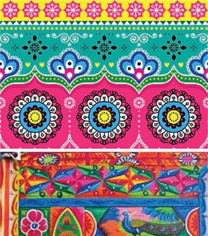
Plying Pakistan’s national highways, Pakistan’s cargo and transportation trucks are beautifully handcrafted using oil paint, making each truck a moving canvas.

Illustrated examples of calligraphic art from Persia and the Subcontinent.

The special edition logo of AdAsia Lahore 2019 was designed as a tribute to AFAA and their member countries who zealously strive to evolve creatively. For the first time an AdAsia logo has been designed keeping the member countries in mind. This logo is used selectively for various branding opportunities, including posters, delegate bags and at the venues.
Comments (0) Closed