
On December 13, 2018, Khaadi turned 20. The brand, synonymous for their value-for-money, trends, design and accessibility, is finding yet more ways to be innovative. Khaadi began their 20th year by doing what no organisation in Pakistan has done before; they removed their name from the logo. Why? Because the brand believes they have become so popular, there is no need to have their name for recognition; the simple ‘hands weaving’ symbol is enough.
Khaadi’s story started when Shamoon Sultan opened his first 400 square feet Khaadi store in 1998 with three million rupees and an ultimatum from his family that if this venture does not work, he would have to join the family business. The good news was that the brand became instantly popular and the stock sold out within days of the launch. Today, Khaadi’s outlets cover 400,000 square feet of retail space and caters to 48 stores across Pakistan as well as in Bahrain, London, Qatar and the UAE.
For Khaadi, the hands are a symbol of moving forward and of a passion that stems from the very beginning of the process. They signify the perseverance, tradition, pushing limits and hard work that go into the final product. They also symbolise the hard work of the craftsman and are stretched to the customer who feels, ‘I have a hand in this’ and a sense of being part of what has been built.
Anjum Nida Rahman, Director Corporate Communications, explains the meaning behind the logo. “What does it mean when you do something by hand? It means there is a lot of essence put into it, perseverance, harmony, synchronicity, resilience and pride that comes with a person who uses their hands to do something, whether it’s designing, creating or writing. We believe that this logo signifies who we are as a company; a very passionate, hardworking, honest sort.”
By 2010, as the stores became larger, the logo required adaptations for signage; hence, the box with the logo above the name was introduced. In 2013, with further expansion, matching the orange in different countries became difficult, so they opted for a black and white approach with the company name and logo in one line – simple and sleek. Finally in 2018, the brand dropped the name and kept the icon, believing the logo is now synonymous with the name.
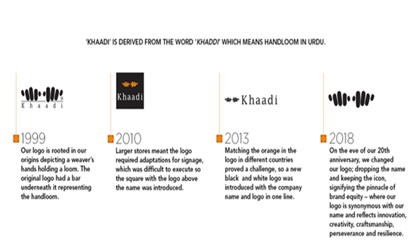
This is not the first time the Khaadi logo has been altered (although never this drastically), however, the hands have remained a constant. The original logo made in 1999 had a bar under the hands, orange in colour to represent the handloom. By 2010, as the stores became larger, the logo required adaptations for signage; hence, the box with the logo above the name was introduced. In 2013, with further expansion, matching the orange in different countries became difficult, so they opted for a black and white approach with the company name and logo in one line – simple and sleek. Finally in 2018, the brand dropped the name and kept the icon, believing the logo is now synonymous with the name.
As this is a big change for the brand, Khaadi wanted to be absolutely certain about this step, which is why, they first experimented the viability of the idea at their flagship store at Dolmen Mall, Karachi. The feedback from customers was that the brand maintained instant recognition, even without the name.
The brand does not wish to do a big reveal; Khaadi has always had an organic journey – starting from the craftsmen’s hands placed with the name – and will continue with that process even now. As attention spans decrease, the belief is that it is essential for brands to project themselves in different ways. This move was made for Khaadi to stay fresh, relevant and in line with their core values of evolving while respecting age-old traditions. For the company, the hands have become the symbol of what the brand stands for. Khaadi’s first store in Abbotabad will open this month; it will just showcase the hands logo (without the name).
Using social media as a part of their operations, one can see the adjustment to the logo starting from their online presence (Facebook, Instagram and website), apart from a few shops that have been altered, and it is prevalent on the new spring collection.
For Khaadi, the tweak in the logo is a shift in their identity and was not undertaken superficially and according to Rahman, one can expect a lot more surprises in the next few weeks and these will first be introduced in Karachi, Lahore and Islamabad and from there, trickle down to other cities.


Comments (1) Closed